Demos is a not-for-profit organisation that delivers research and education on governmental policy and public opinion. They collaborated with WWF (World Wildlife Fund) to explore public opinion on environmental policies and the trade offs of policy change.
Demos and WWF partnered with us to deliver the UX and UI design for their national survey.
- Lead time:
- 8 Weeks
- Sector:
- Environment & Politics
- Target Type:
- B2C
- Demoographic:
- General Public
- Goal:
- Engage the public and capture high quality data
- Services:
- Workshopping, Concept Creation, User Testing, UX & UI Design
- Features develivered
- Design Concept
- UX/UI Design
- Clickable Design Prototypes
- User Testing
- Frontend Development Consultancy
- Team
- 1 x Strategist
- 1 x UX Designer
- 1 x Project Manager
- 2 x Back-end Developers
- 1 x Frontend Developer
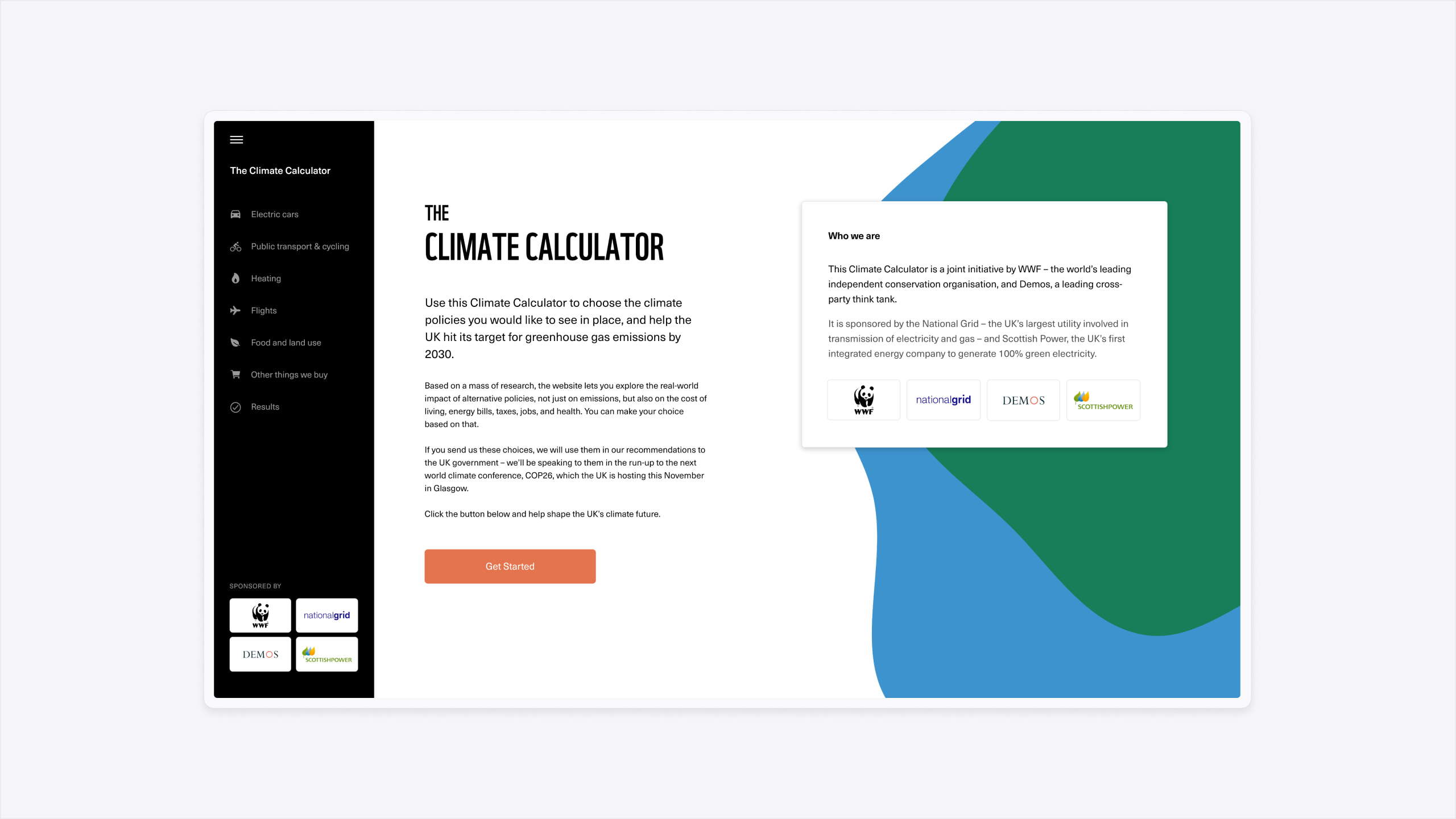
The challenge
The survey needed to gather public opinion on important environmental challenges and the policies that support them. To do this, we needed to create a survey design that could rapidly communicate complex environmental issues and the consequences of different types of policy change. By engaging users in this way, we could gather their feedback on the consequences of proposed changes.
The concept
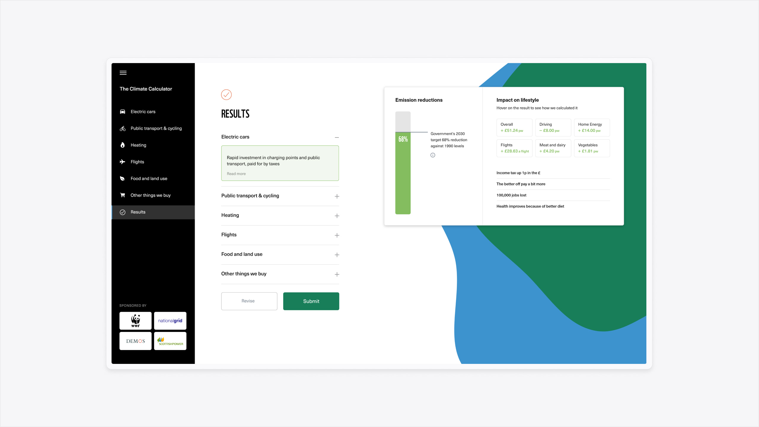
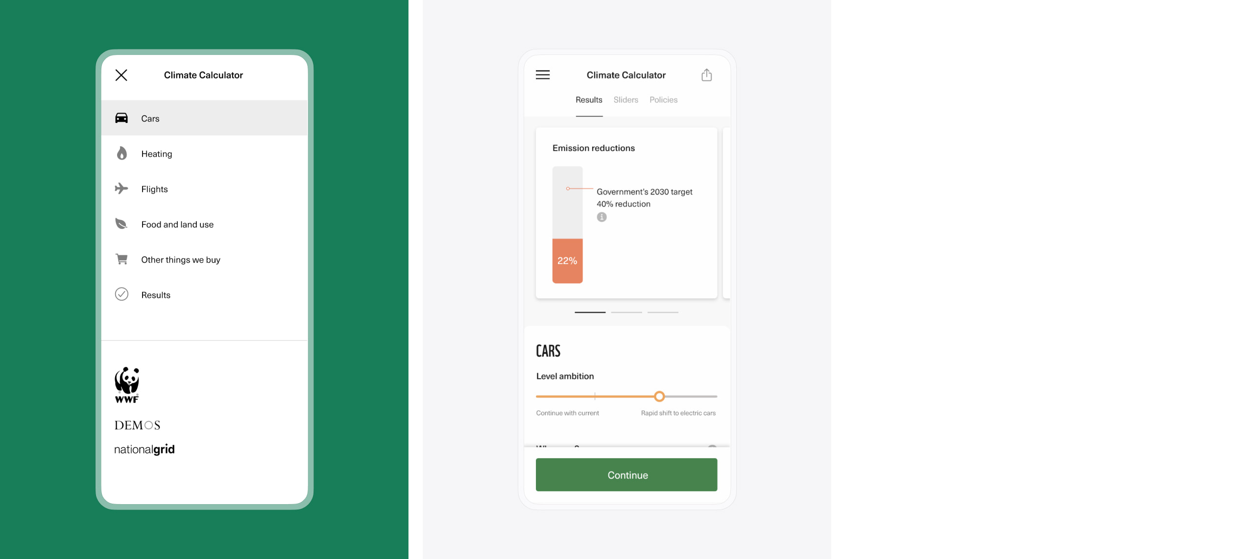
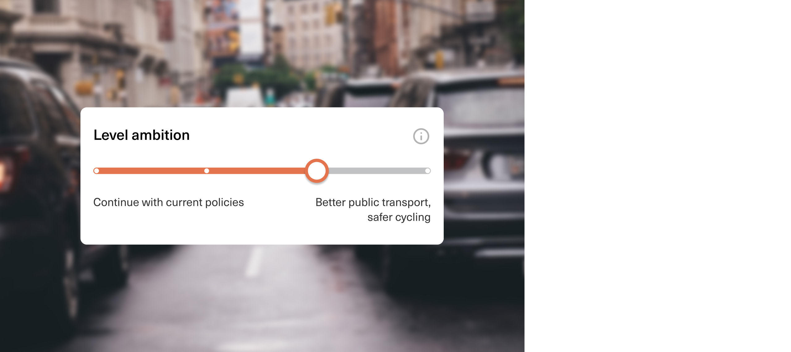
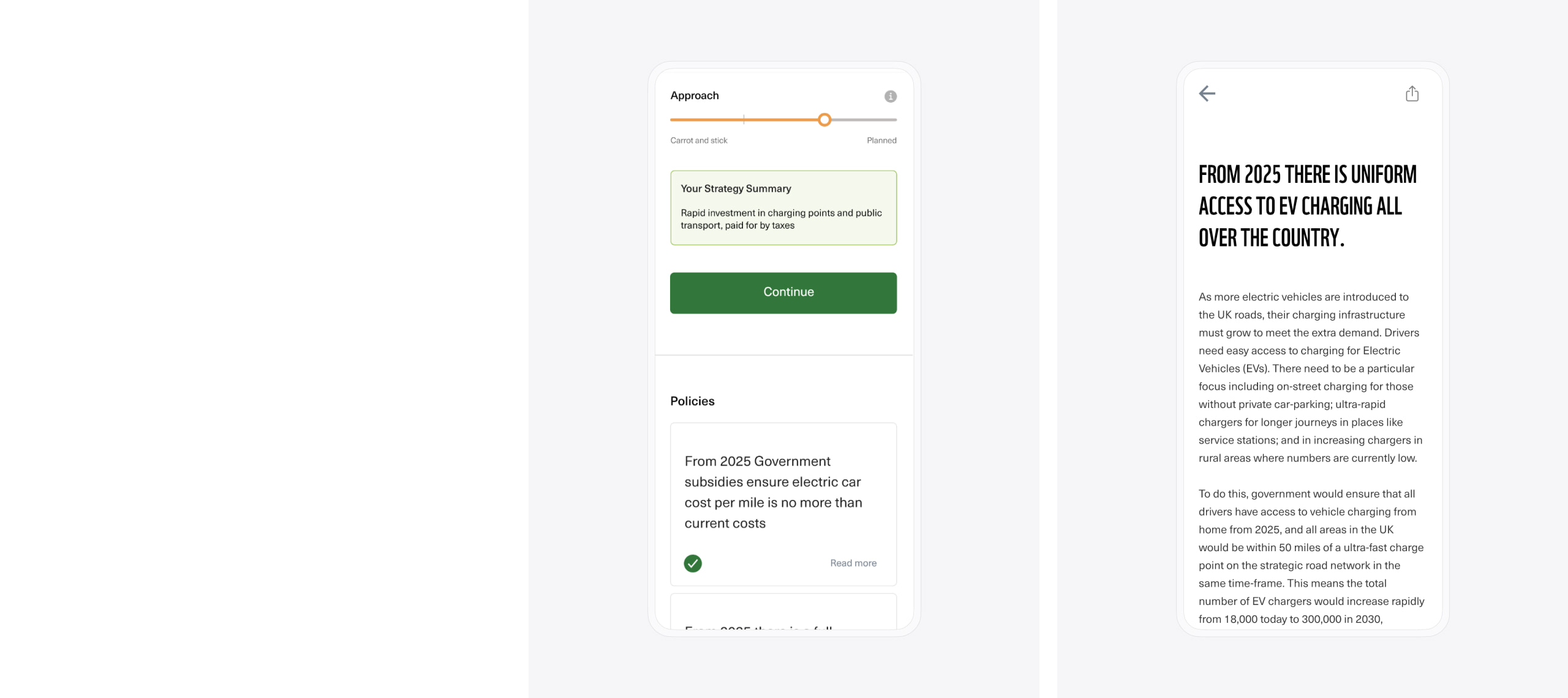
To combat the challenge of information complexity, our UX team created a ‘This or That’ concept for the survey. By leaning into a game format that most people are familiar with, we could reduce the learning curve required to take the survey and get the best data from each response.
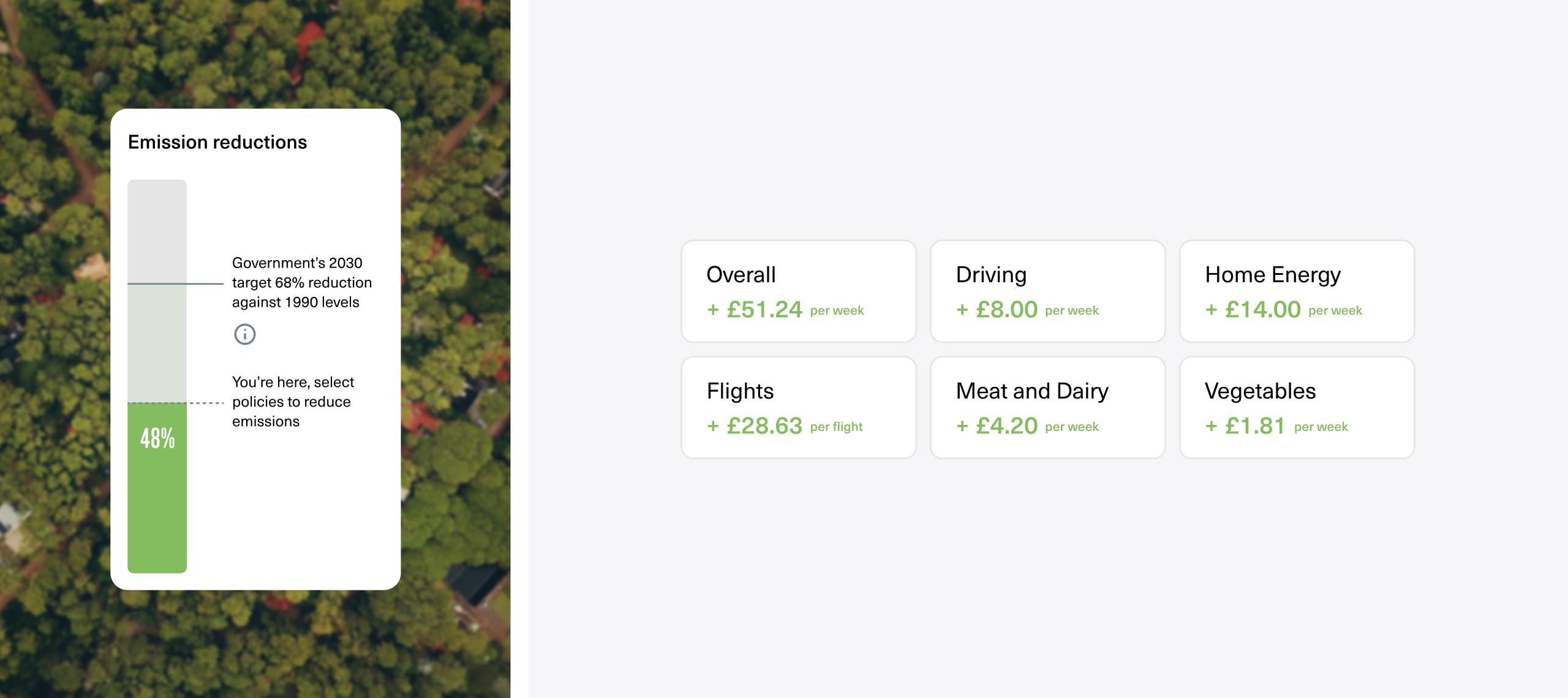
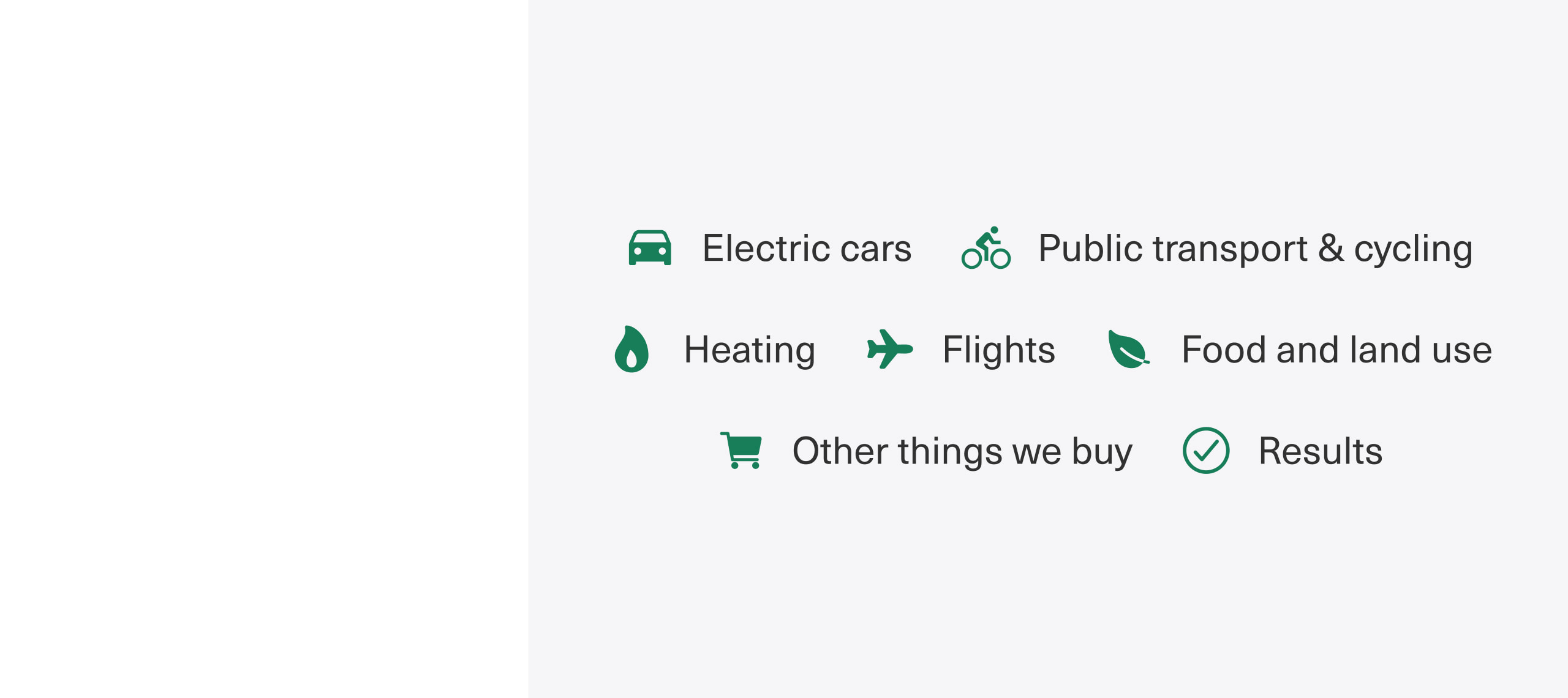
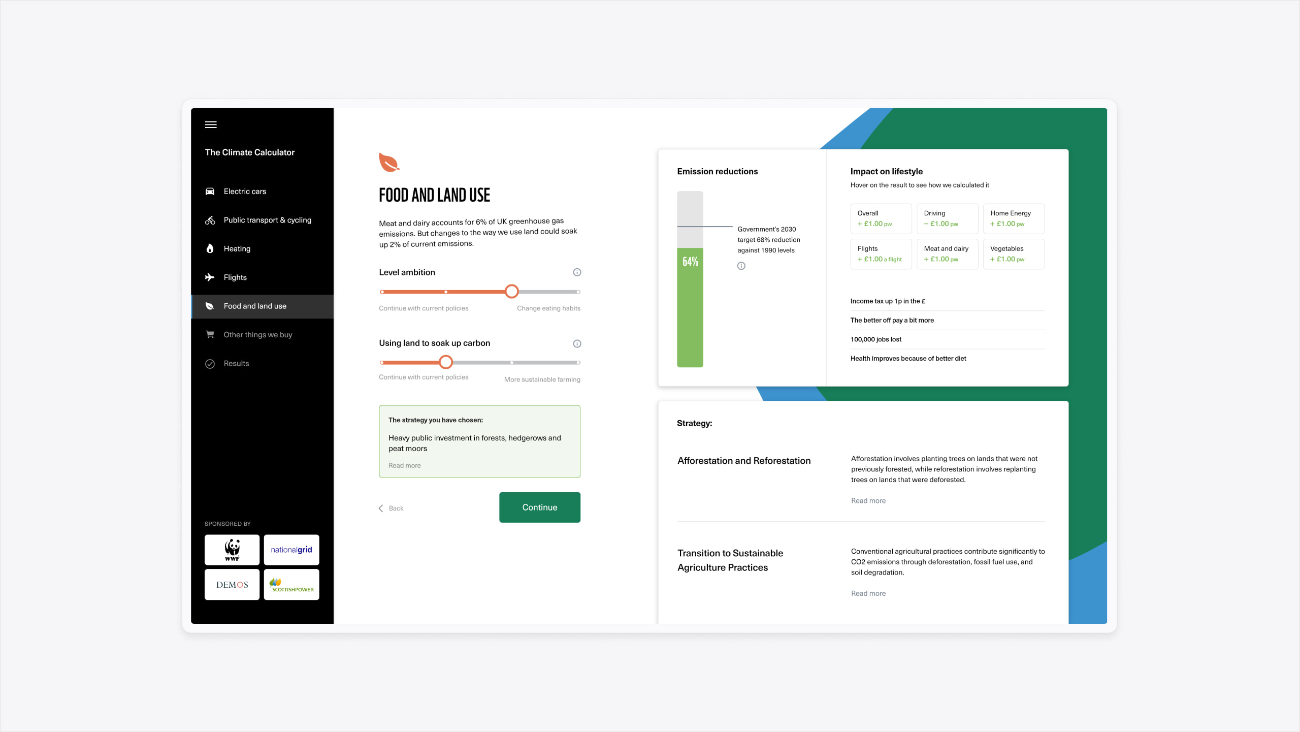
We presented users with a number of ‘This or That’ scenarios where they could select their preferred option. Each scenario proposed the financial and environmental impact of a policy. For example, increasing taxes on air travel could pay for green energy initiatives.
The ‘This or That’ concept enabled us to represent information in a visual way that would simplify the information and engage users.
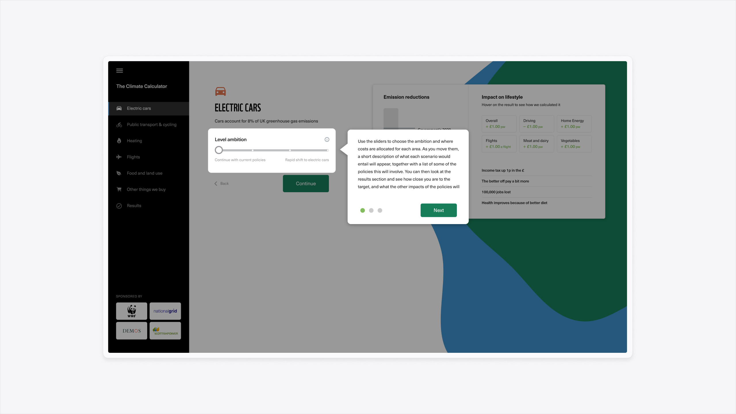
Overcoming perception
To deliver the greatest results from the survey, we tested two variants of the design before launch. The variants focused on how we visually communicated the impact of environmental policies on carbon emissions.
For those of us raised in the UK, we’ve been trained by the media to understand that a chart going up is a good thing. Most televised charity campaigns would use the visual representation of a thermometer going up to meet a target. However, when it comes to climate change and carbon emissions, the thermometer going up isn’t good at all. Our challenge was how we could visually represent the outcome of policy change while correctly communicating the positive/negative outcome to users.
We qualitatively tested one variant that showed a chart going down to represent lowered emissions, and a second variant where the chart went up to meet a goal. The second variant where the chart increased was found to be the most successful variant and was used within the campaign. Therefore, each scenario was presented to demonstrate emission reductions in the chart (bar going up) rather than emissions (bar going down).