Utility Warehouse is a UK-based multi-utility provider with over 600,000 customers, 40,000 independent distributors and more than 600 customer support staff. They supply customers with landline telephony, mobile telephony, broadband, gas, electricity, insurance and cashback services.
- Project Length:
- 12 Weeks
- Sector:
- Utilities
- App Goals:
- Increase Engagement, Reduce Friction, Improve Onboarding
- Services:
- UX Design & UI Design, Design To Development Handover
- The Approach
- User Interviews
- Research
- User flow definition
- Low fidelity prototype
- High fidelity design
- Design to Development team handover
- The Schedule
- Phase 1 was delivered in 3 months
- The project was delivered on time and on budget
The challenge
The main challenge we faced was how to empower the development teams across the company to work independently while still providing a consistent experience to end users. While many of the development teams are highly-skilled in their respective areas, many of them were not particularly well placed to develop front-end systems. As a result, many of the applications deployed had inconsistent UI/UX and were often built on different technologies, depending on what each team was most familiar and comfortable with.
The existing solution
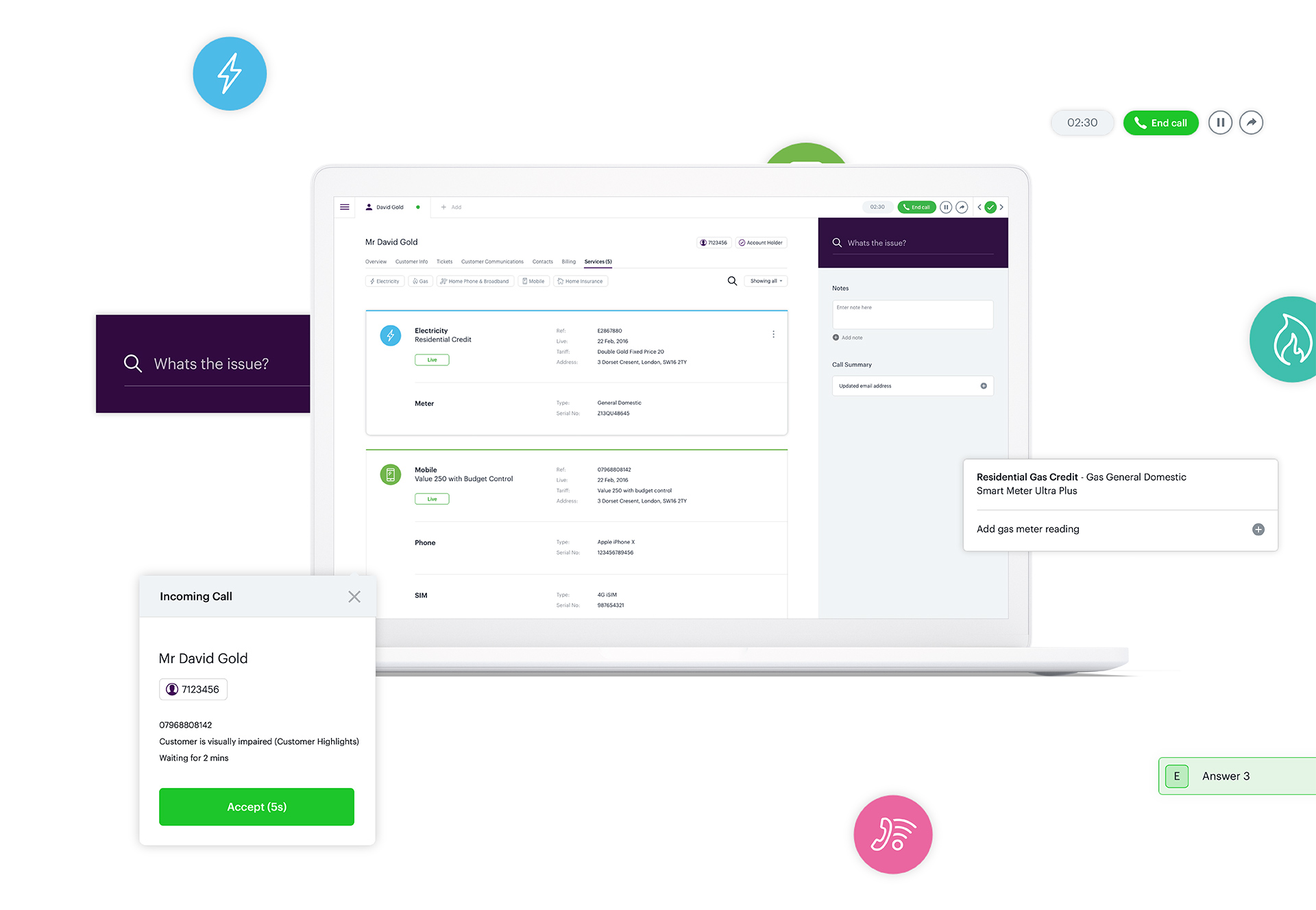
As a multi-utility provider, Utility Warehouse have many different internal applications, with many different development teams, each focused on their own service domains. As such, development of systems is handled by the different teams responsible for each product domain, allowing those teams to build the systems required to deliver the maximum value to that part of the business. Our initial focus was on the customer service systems within Utility Warehouse which represented the biggest opportunity to drive results in efficiencies, improving customer service results and reduce time in onboarding new staff.

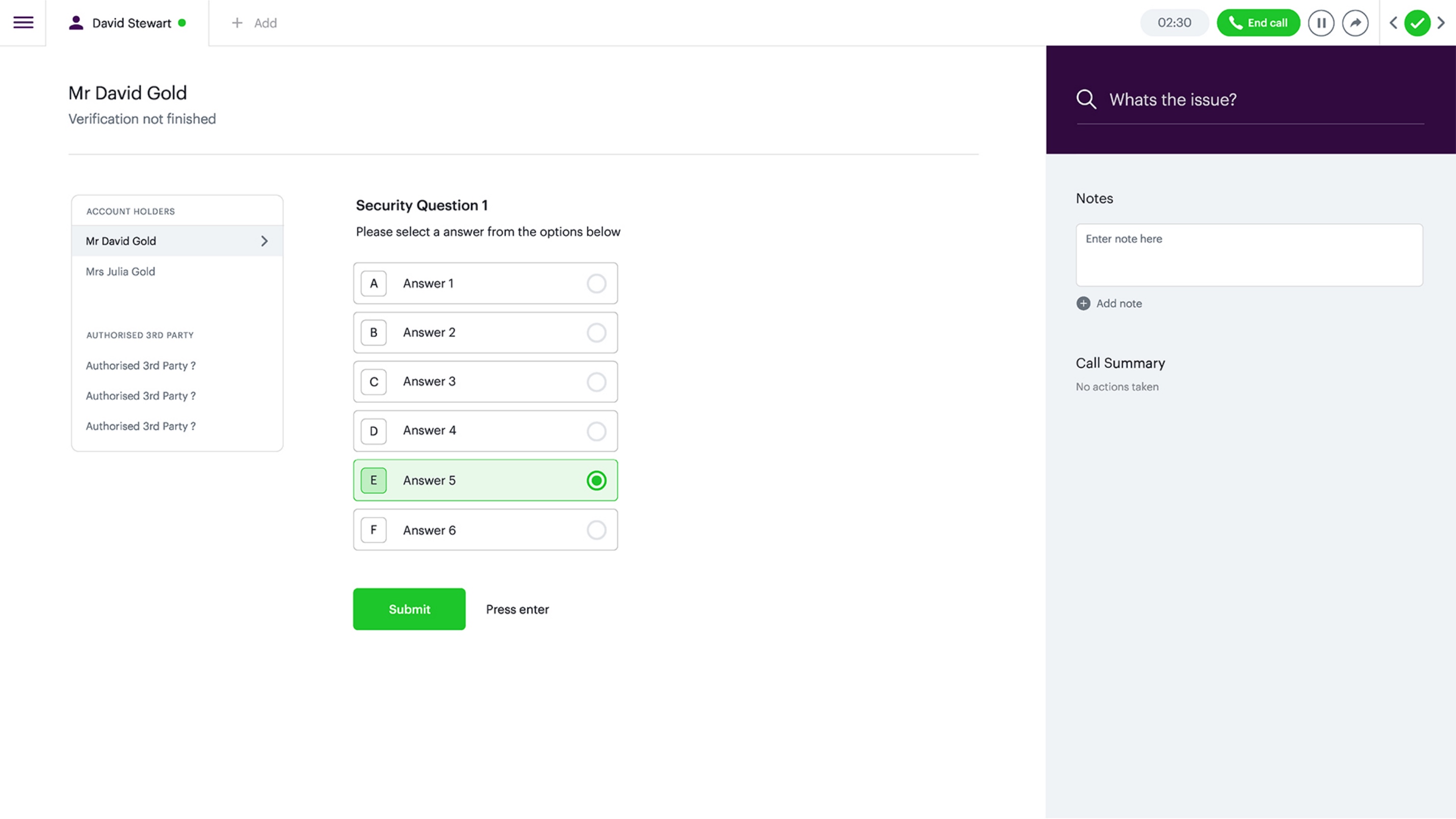
Faster verification
With a combination of simple and clear options for forms and combined keyboard shortcuts for users, verification is now simple, clear and fast.

Structured data
By working with users, we identified the information they needed on-hand and designed a more useful way of displaying key data.
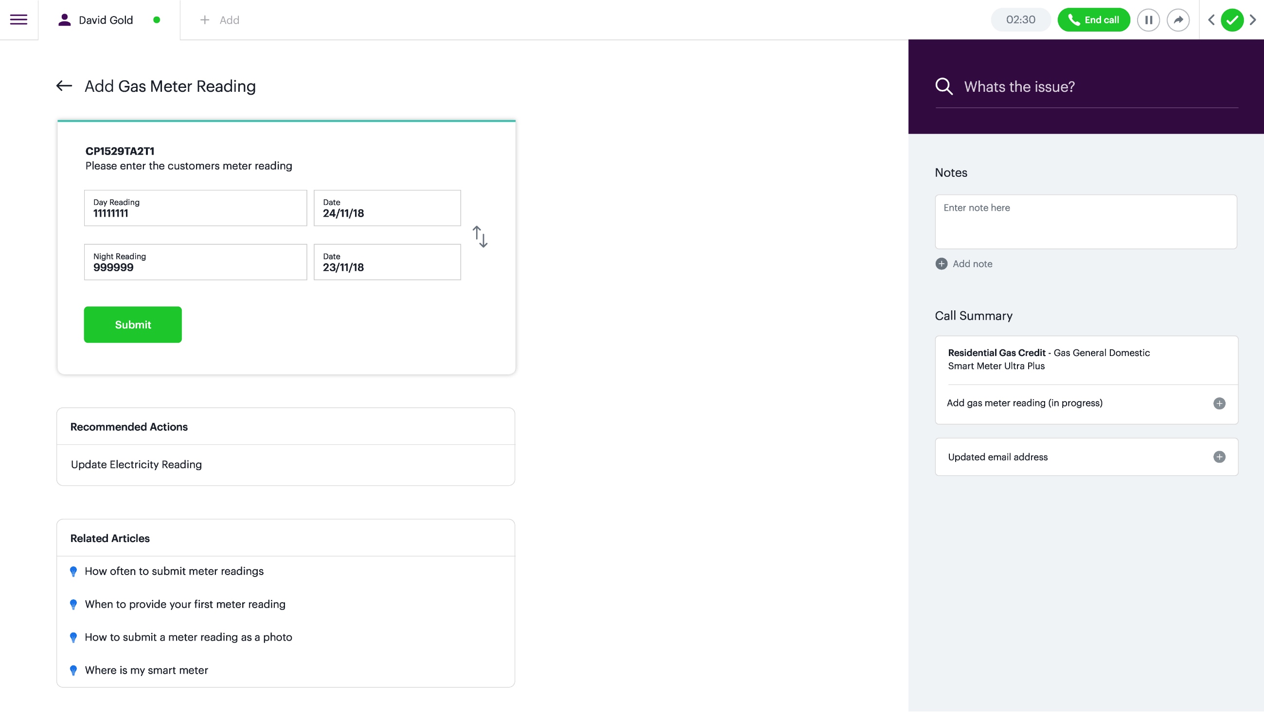
Reducing clutter
By focussing on important and actionable information, we greatly reduced clutter on page.
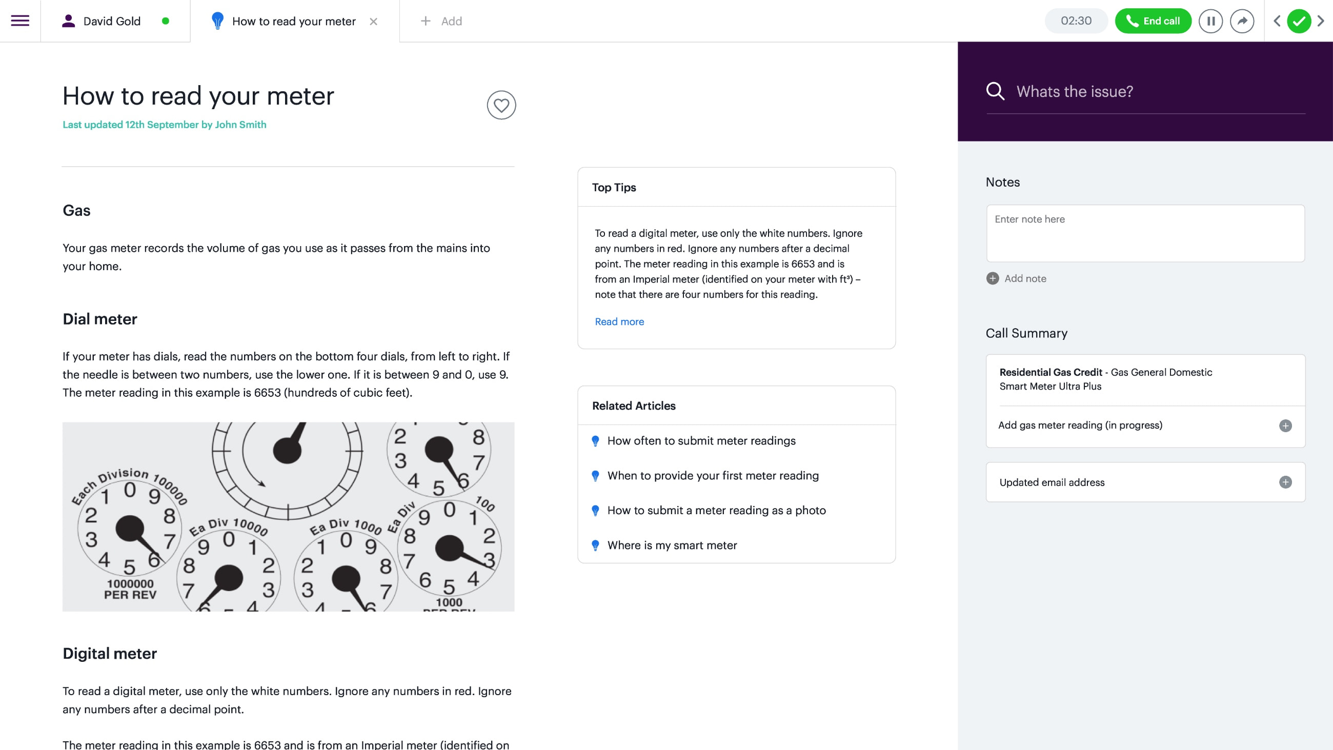
Enabling the user
Users have a huge amount of information at hand to help them perform their role better. We integrated a better way to access this information, on-the-go.
The Goal
Harmonise user experience, accelerate delivery time and build a consistent UI look and feel that delights users and echoes the company values and culture across all Utility Warehouse applications.
