Prisym ID provides an enterprise grade ERP system to some of the largest pharmaceutical companies in the world. They were undertaking a long term digital transformation project to transition them from an installed product model to a cloud-based offering. Part of this modernisation strategy was to develop an entirely new user interface that enabled them to manage the lifecycle of their global pharmaceutical products, including the labelling in different languages, managing regional legal requirements, process flows and product information.
- Lead time:
- 18 Months
- Sector:
- Healthcare & Pharma
- Goal:
- Transition to a cloud-based product offering
- Services:
- Digital Transformation, UX Design, UI Design, Frontend Development
The challenge
Prisym challenged us to de-risk the digital transformation project, drawing on our insights from other successful projects. Our team collaborated on an embedded basis, providing technical digital transformation consultation, UX/UI design and frontend development.
As part of their ongoing project, Prisym wanted to enable their team with a clear and on-brand design system, and the delivery of a best practice code base. This would mean that they could manage and grow the product far beyond the initial project delivery. With such a large complex product, Prisym’s customer support burden was also high. They wanted to reduce the amount of support required by investing in the UX design of the interface.
The existing solution
Prisym’s existing software was enormous and had become bloated from continuous innovation over its lifespan. Years of organic growth left the company with an inconsistent design system and a number of different javascript libraries that had reached end of life and were no longer supported.
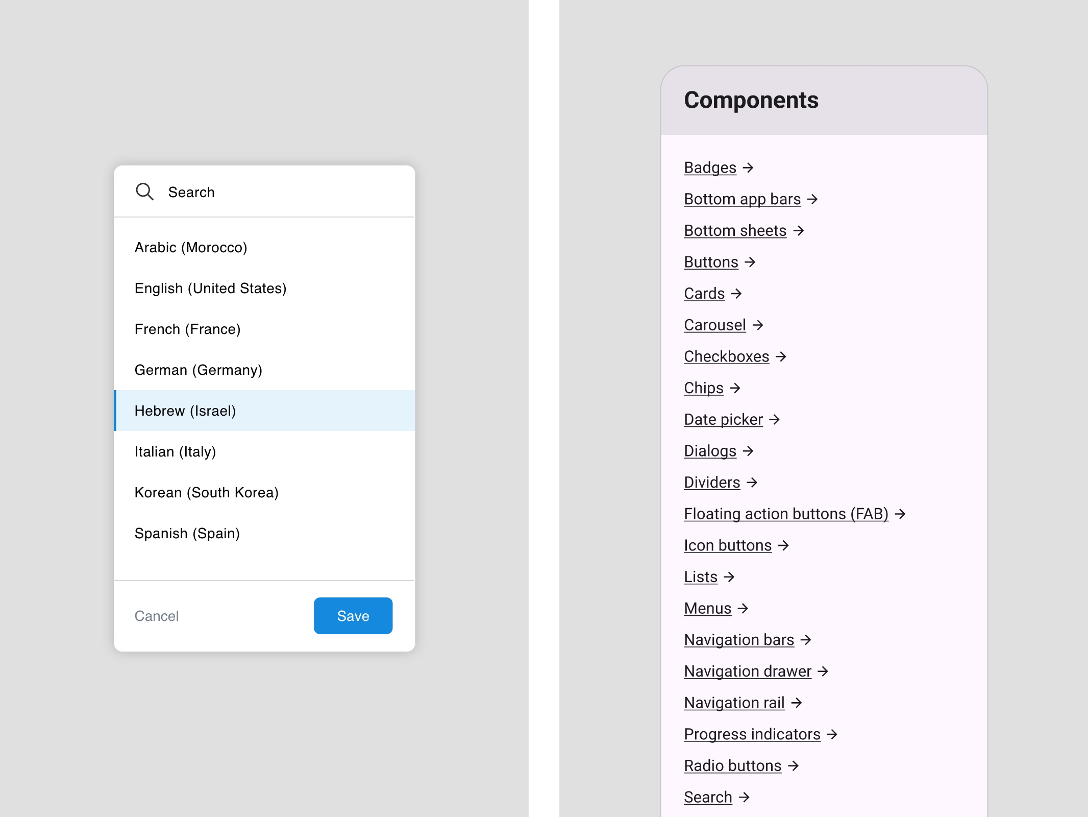
They needed a streamlined design system to simplify the product design, and new frontend code to unify the platform and ensure that the latest best practice code was used.
- Scope
- Digital Transformation Consultation
- Embedded Team
- User Journey Mapping
- Wireframe Prototypes in Adobe XD
- Design Prototypes in Adobe XD
- Design System
- Aesthetic Interaction Design
- Frontend Development (React)
- Resource
- 1x Senior UX Developer
- 1x UI Designer
- 1x Technical Project Manager
- 2 x React Developers
The design
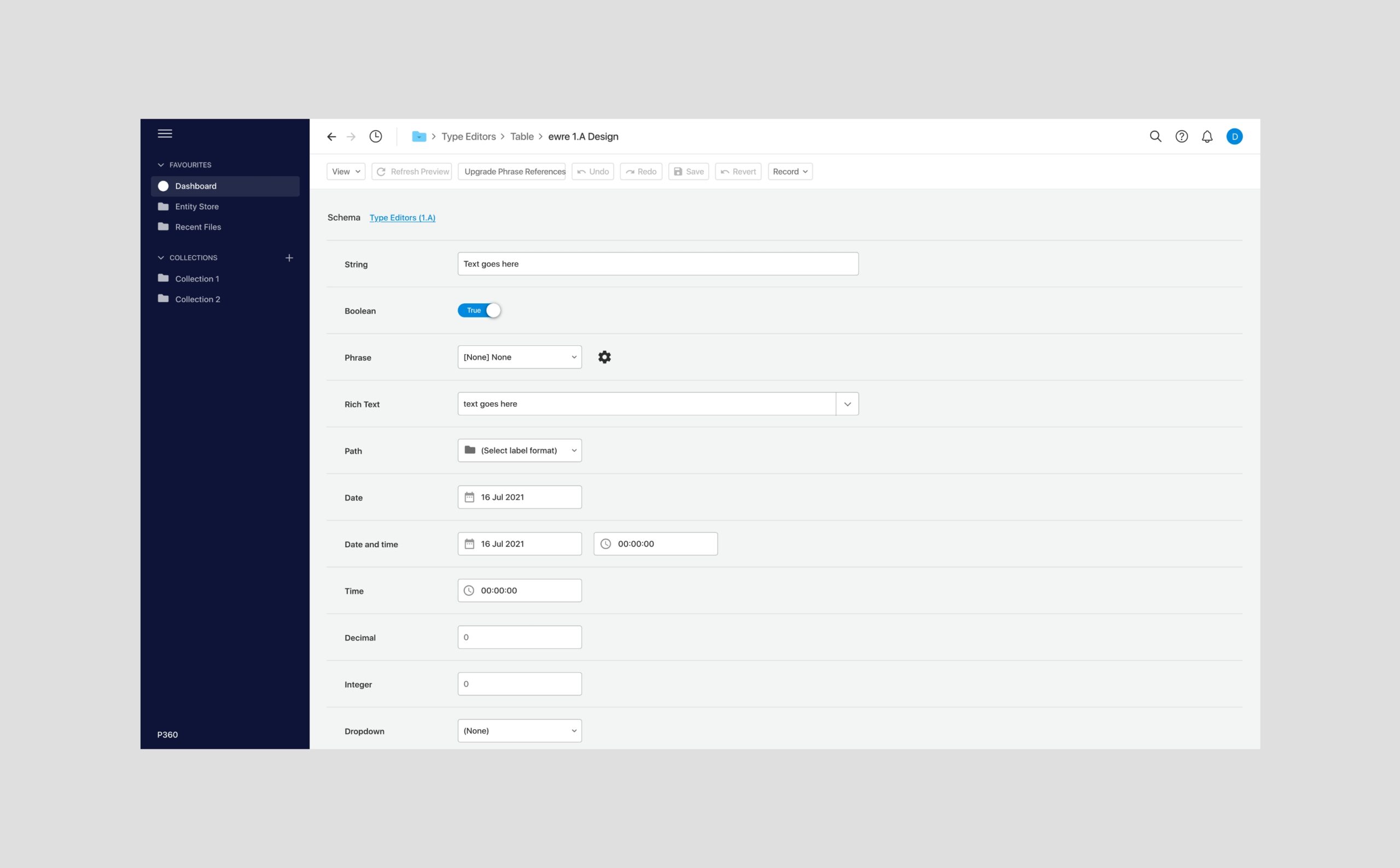
We created a new streamlined design system that could be utilised throughout the platform and managed by Prisym’s internal design team. This approach enabled Prisym’s internal team and improved the efficiency of the development part of the project, delivering greater value to the business.
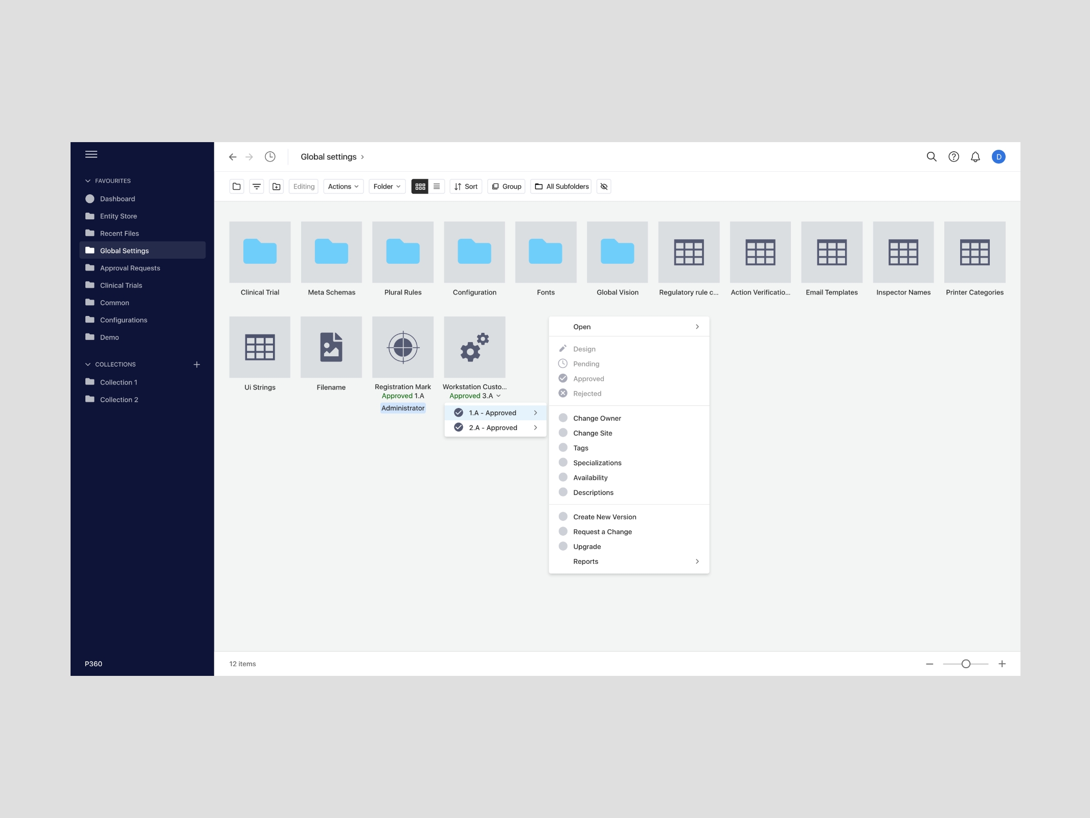
We collaborated with Prisym’s product team to deliver designs in planned weekly sprints. We began by delivering the universal architecture of the platform, addressing global menus and styling, before working on the user journeys through the product.
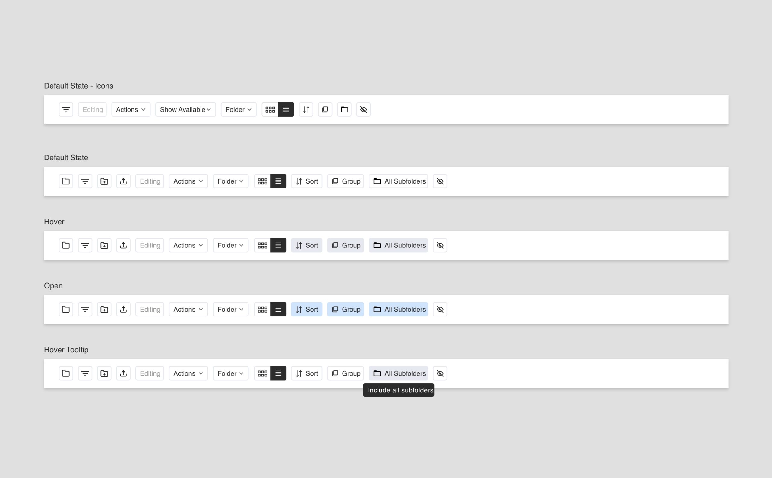
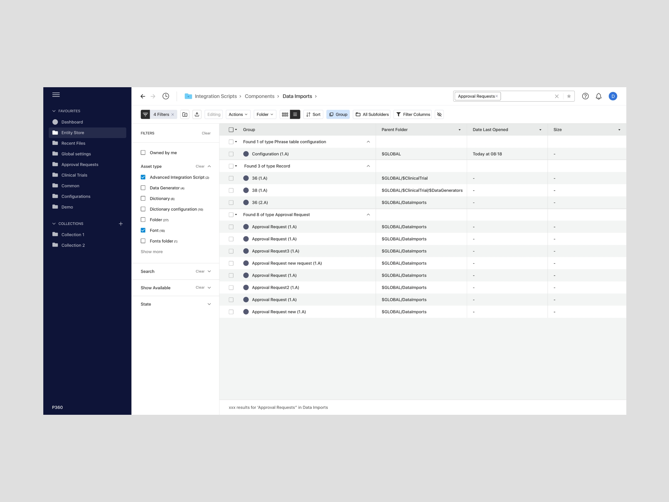
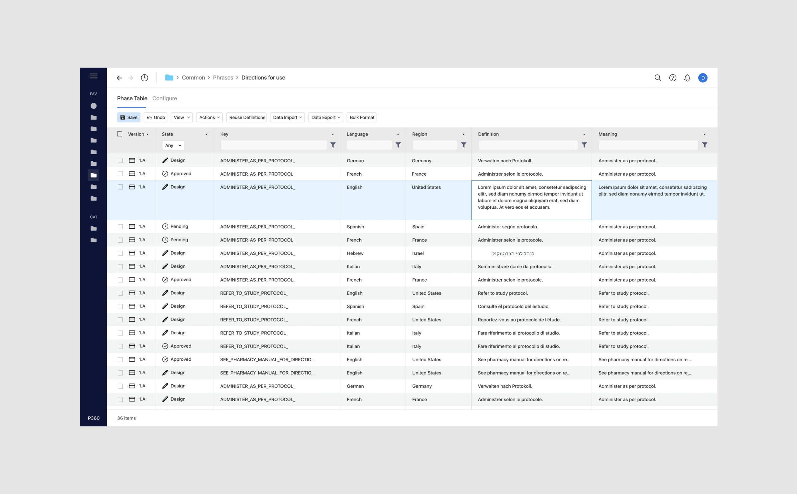
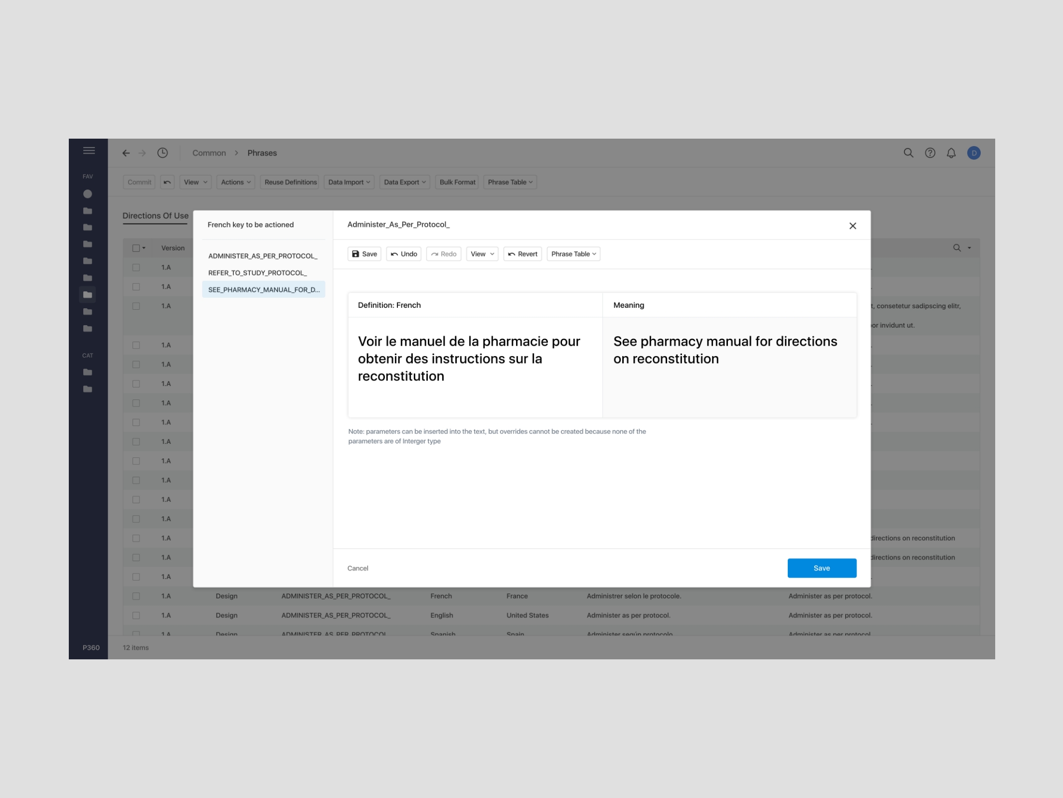
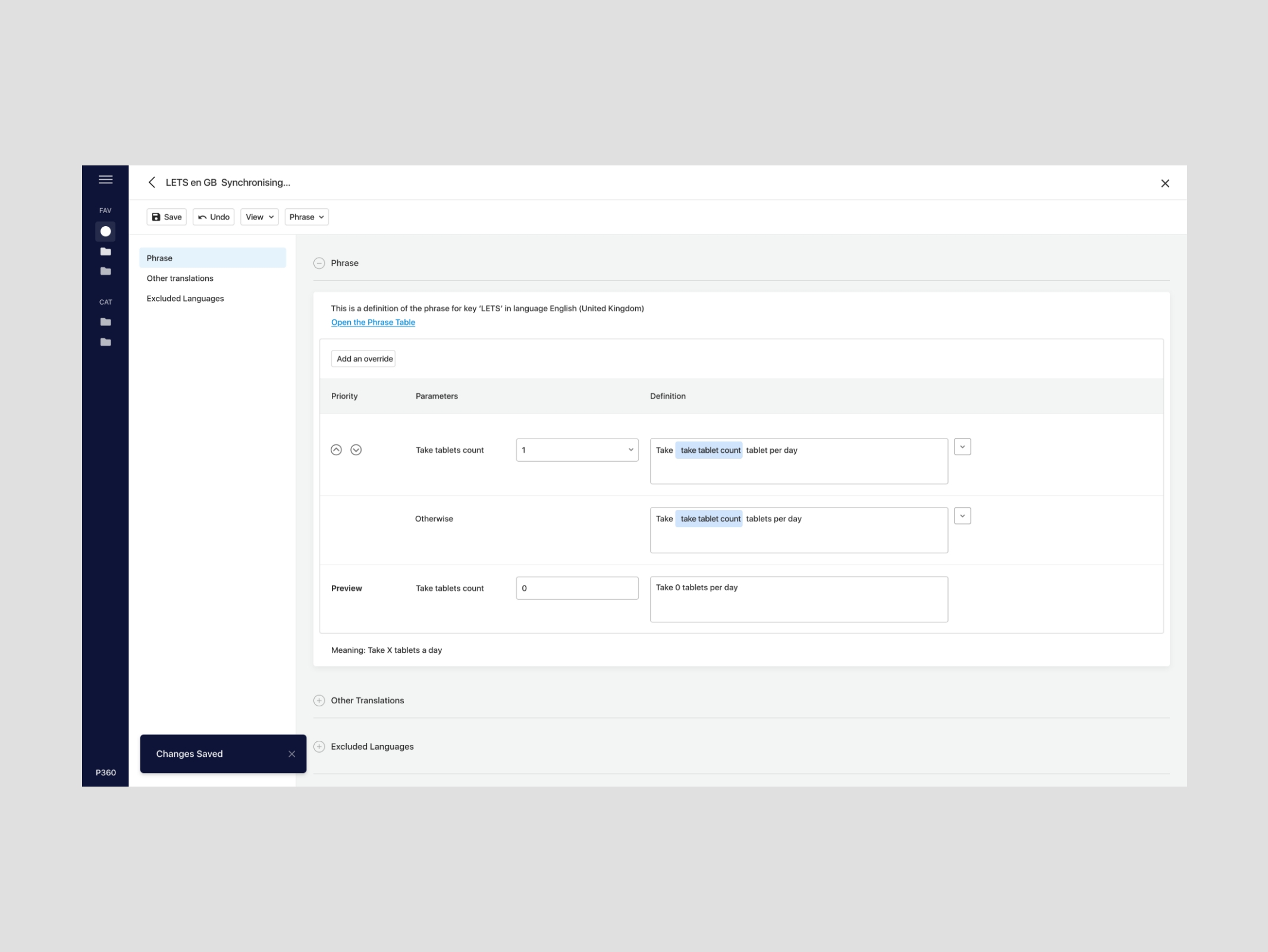
The product is complex with a large amount of functionality, so our challenge was to make this digestible and intuitive to users. Our focus was on simplifying the platform, using as few screens as possible within a user journey.
One of the biggest design challenges was to create something fresh and modern that would work in responsive way and would be easier to use by new users, while also remaining familiar to existing users.
Once approved, the designs were handed over to our development team to start coding.


The development
The existing product used a variety of javascript libraries and many of these were no longer supported or reaching end of life which increased the risk of the support ecosystem. With browser updates happening daily, their legacy code would become ever more fragile over time. Prisym’s leadership team took this opportunity to standardise and consolidate their product, improving the user experience.
Prisym identified that they needed to modernise the code base by moving to a new javascript framework. The question was which one.
We worked with Prisym’s development team on an embedded basis, adopting their processes and IT systems including Azure DevOps, stand ups with their team, backlog management, prioritisation, and estimating. We led the team to assess the suitability of React and Angular for the frontend code base.

React or Angular?
Angular and React have a multitude of pros and cons between them, and how portable legacy components were into the new frameworks was a key measure of how long and how complex and costly the project would be. Understanding this compatibility between old and new was critical to the success of the project from a commercial perspective.
We coded 2 POCs to test the suitability of both approaches. In the end, React won out on the technical side and was selected for the project development.

